
If you have ever watched a great t-shirt design turn into a muddy, misregistered mess on the press, the culprit was almost never the ink — it was the artwork. An SVG for screen printing has to do something a normal web graphic never has to: it has to be chopped into separate layers, one per ink color, and those layers have to line up within a fraction of a millimeter. Gradients, soft shadows, and thousands of stray anchor points that look fine on a monitor become registration nightmares on a screen. The good news is that building separation-ready vector art is a repeatable process, and Super Vectorizer Pro plus a basic vector editor gets you most of the way there in minutes.
Ready to turn a raster logo into clean, scalable vector paths? Try Super Vectorizer Pro free trial to preview vectorization results.
Compatible with macOS 10.10+ (M1/M2/M3) & Windows 7/8/10/11
Our Verdict: Two Ways to Get Screen-Print-Ready SVG
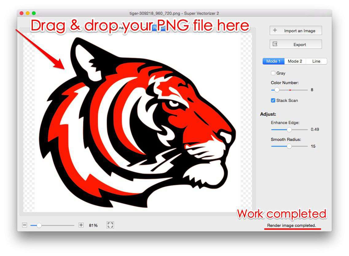
Most shops hit the same fork: rebuild the artwork natively in a vector editor for total control, or convert an existing raster logo into vector paths and then separate the colors. If you already have a clean PNG, JPG, or BMP of the design, conversion is dramatically faster — you spend your time on separations, not redrawing.
Convert with Super Vectorizer Pro
- Turns a raster logo into editable vector paths in one pass
- Preserves the shape and proportions of the original artwork
- Free trial available to preview the tracing before you commit
- Exports to SVG you can open in any editor to separate colors
- Best when the source art is already a finished design
Draw Natively in Illustrator / Inkscape
- Maximum control over every node and separation
- Ideal for brand-new artwork built from scratch
- No tracing artifacts to clean up afterward
- Slower — every shape is drawn by hand
- Best when no usable source file exists
What Makes an SVG Good for Screen Printing
The single most important rule for an SVG for screen printing is: one color per layer, with no blending between them. A screen can only lay down one ink at a time, so every color in your design must exist as its own closed shape. When you open the file in your editor, you should be able to click a color and isolate it as a separate object. If colors are merged into gradients or grouped into a single complex path, the prepress step becomes a painful manual rebuild.
A second rule is avoid photographic detail. A six-color halftone photograph is technically possible, but it is slow, expensive, and unforgiving on press. Strong screen-print graphics are built from flat color blocks, bold type, and clean line work — exactly the kind of art that converts beautifully to vector. Think band logos, sports marks, illustrative badges, and typographic statements rather than continuous-tone photos.
The Screen-Print Prep Workflow, Step by Step
Whether you convert or draw, the path to a press-ready file is the same. Here is the sequence most shops follow:
- Get a clean vector. Convert your raster source with Super Vectorizer Pro, or build the artwork in a vector editor. Aim for the fewest anchor points that still hold the shape — over-complex paths slow every later step.
- Simplify to spot colors. Replace every gradient and tint with a flat color pulled from your ink library. Each ink gets one exact hex or Pantone value.
- Separate by color. Move each color onto its own named layer (e.g., "Red", "Black", "Cream"). This is what your separation software or press operator reads.
- Add traps and overlaps. Expand shapes slightly so adjacent colors overlap by 0.5–1 pt. This prevents thin white gaps (registration drift) between colors on press.
- Check the underbase. For dark garments you usually print a white underbase first, then the colors on top. Build that as its own layer.
- Export clean. Save as SVG (or the format your separator prefers) with layers intact and no embedded raster previews.
Spot Colors, Not Gradients: The Key Distinction
This is where most beginners go wrong. A gradient is technically a smooth transition between two colors, but a screen can only deposit one ink per pass. To print a gradient you have to simulate it with halftone dots — tiny circles of varying size that the eye merges at a distance. That is a specialist technique. For 90% of jobs, the cleaner solution is to replace the gradient with two or three solid spot colors and let the design carry the energy.
When you convert a raster image, auto-tracing will happily recreate gradients as thousands of tiny vector facets. That is useless for screen printing. After conversion, flatten those facets back into solid color regions in your editor — merge same-colored pieces, delete speckle, and end up with a handful of clean blocks. Your separator (and your press operator) will thank you.
Common Screen-Print SVG Mistakes to Avoid
- Too many colors. Every extra ink is another screen, another setup, another chance for misregistration. Trim to 1–4 colors wherever the design allows.
- Thin lines and tiny type. Below about 1 mm, fine strokes fill in or break up on press. Bolden type and thicken strokes before you separate.
- No traps. Without overlap, slight press drift leaves white hairline gaps. Add a small trap between touching colors.
- Embedded bitmaps. An SVG that hides a PNG inside it is not a true vector and will not separate. Re-trace or remove the raster element.
- Over-complex paths. Tracing at maximum detail creates anchor-point soup. Simplify aggressively; clean shapes cut and trap better.
| Requirement | Draw From Scratch | Convert + Separate |
|---|---|---|
| Setup time | Slow (manual redraw) | Fast (auto-trace, then separate) |
| Needs a source file? | No | Yes (PNG/JPG/BMP) |
| Control over nodes | Total | Good after cleanup |
| Best for | Brand-new artwork | Existing logos |
Color Separation Best Practices
Screen printing requires each color to be printed as a separate layer through its own screen. The SVG file should already have colors organized into distinct groups or layers. If your design uses gradients or transparency, these must be simulated using halftone patterns or simulated process color before the SVG can be used for traditional screen printing.
When preparing SVG for spot-color screen printing, limit the palette to the actual ink colors you will print. Each spot color should be a solid fill with no gradients, and the total color count should match the number of screens in your print run. Most manual setups handle 4 to 6 colors efficiently; beyond that, consider simulated process printing instead.
For simulated process printing, convert the design to CMYK plus spot colors (white underbase, special effects) and create a separate SVG layer for each separation. Each layer should be exported as a high-resolution bitmap halftone and burned to its own screen. This approach handles photographic images and complex gradients that traditional spot-color printing cannot reproduce.
Frequently Asked Questions
Can I screen print directly from a PNG?
Not cleanly. A PNG is a fixed-resolution bitmap, so any scaling blurs and it carries no separate color layers. You convert the PNG to an SVG first, then separate the colors into individual screens. The SVG step is what makes the art scalable and separable; the separation step is what makes it printable.
How many colors should my SVG have for screen printing?
For cost and reliability, aim for one to four spot colors. Each color is one screen and one setup, so fewer colors means faster, cheaper, and more consistent prints. Bold two- and three-color designs are the workhorses of the industry for good reason.
Do I need special software to separate the colors?
Not necessarily. Any vector editor (Illustrator, Inkscape, Affinity Designer) lets you move each color onto its own layer by hand. Dedicated prepress or separation plugins speed this up for complex jobs, but the core idea — one layer per ink — is the same either way.
What about gradients and shadows in my design?
Replace them with flat spot colors before going to press. Gradients must be faked with halftone dots, which is advanced and easy to get wrong. Solid color blocks print cleaner, faster, and more cheaply, and they suit the bold screen-print look better anyway.
Turn Your Logo Into Print-Ready Vector Art
Start with a clean vector: convert your raster logo with Super Vectorizer Pro and preview the tracing with the free trial, then separate colors in any editor.
Compatible with macOS 10.10+ (M1/M2/M3) & Windows 7/8/10/11
Related Articles
Try These Free Online Tools
No download required — convert, compress & optimize SVGs right in your browser
PNG to SVG Converter
Convert PNG, JPG, BMP images to scalable vector graphics instantly
PNG to SVG ConverterSVG Compressor (Mini)
Reduce SVG file size by up to 80% without losing quality
SVG Compressor OnlineSVG Optimizer
Clean up SVG code, remove redundant data and optimize for web
SVG Optimizer OnlineJPG to SVG Converter
Turn JPEG photos into crisp vector artwork in seconds
JPG to SVG ConverterEPS to SVG Converter
Convert EPS vector files to web-friendly SVG format
EPS to SVG ConverterAll Free Tools
Browse our complete collection of free online conversion tools
Browse All Free Tools