
Tracing a JPEG is guesswork done carefully: the file contains no shapes at all, so the tracer has to decide which pixels belong to the same region, find the outline of each region and then replace the stair-stepped pixel edge with a curve. That is why a traced JPEG looks right on logos, plans, scans and flat illustration, and wrong on faces — the information needed for a face was thrown away when the photo was saved.
What happens between the JPEG and the path data
Four passes, and three of them exist only because the input is JPEG rather than a clean bitmap:
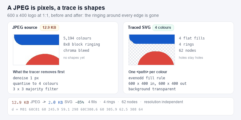
- Denoise. A small box blur, 1 or 2 pixels wide. JPEG ringing sits right against every hard edge, so this is the pass that stops a flat blue panel from being recorded as fourteen shades of blue.
- Quantise. The photo is reduced to the palette size you pick, using a median cut over a 15-bit colour histogram. Four colours for a two-tone logo, eight for flat illustration, sixteen or twenty-four when the art has gradients you want to keep as bands.
- Majority filter. A 3×3 vote over the colour labels, run twice. One stray pixel inside a flat area is noise; a pixel that disagrees with seven of its eight neighbours is almost always noise, and removing it before contour tracing is the single biggest reduction in path count this tool makes.
- Contour trace and curve fit. Every boundary between two colours is walked as a closed ring, simplified with Douglas-Peucker, then turned into cubic Beziers. Corners sharper than about 68° keep their sharp point; everything else is smoothed with a tension you control.
The number of nodes in the statistics line is the honest measure of complexity: a logo lands in the low hundreds, a photograph in the tens of thousands. When the node count explodes, the fix is almost always fewer colours and a wider denoise, not more detail.
How many colours to choose
Colour count is the main lever, and it is not linear: each extra colour adds a new set of contours, so both the node count and the file size climb faster than the palette does. Measured on an 800×600 photograph saved as a 33.5 KB JPEG, at the default detail and smoothing:
| Colours | SVG size | Rings | Nodes | Use it for |
|---|---|---|---|---|
| 4 | 26.9 KB | 77 | 954 | Two-tone logos, stencils, screens |
| 8 | 62.3 KB | 205 | 2,368 | Flat illustration, UI mockups |
| 16 | 82.2 KB | 275 | 3,138 | Maps, plans, posters with banding |
| 24 | 89.5 KB | 307 | 3,475 | The ceiling before a photo turns to mush |
Two things worth noticing in that table. The jump from four colours to eight more than doubles the file, because every gradient in the photograph needs a second band and each band drags its own contours in. After that the growth flattens fast: sixteen colours cost about a third more than eight, and going on to twenty-four adds under a tenth, because most of the extra colours only re-cut regions that already exist instead of adding new area. What keeps climbing is fidelity, not bytes — and past about sixteen colours a photograph is a mosaic of bands that no longer reads as a vector version of anything. If that is what you want, the honest tool is a colour tracer with more engine behind it, such as VTracer, and this page is the better choice for flat art where you want clean curves and a small palette.
JPEG noise is what breaks a trace
A JPEG is compressed in 8×8 pixel blocks, and at a hard edge the transform leaves a ripple that extends a few pixels into both sides. To a naive tracer that ripple is real detail: it becomes a stack of one-pixel contours hugging every letterform, which is why so many online converters return a 2 MB SVG of a 40 KB logo. The cure is not a bigger tolerance on its own but a sequence: denoise first, then quantise, then vote.
The Detail slider controls the smallest region that survives, from roughly one part in 7300 of the image at 10 down to one part in 800 at 1. Dragging it to the left removes specks and stray dots; dragging it right keeps small type and thin strokes, at the cost of many more paths. If your artwork has 12 px text, trace it at a larger pixel size rather than raising detail on a small image: a JPEG already lost the information.
Background knock-out, and when it fails
The background option samples the average colour of the border pixels, then floods inwards from every edge, clearing pixels within the tolerance. Because it floods rather than thresholding the whole image, white inside the artwork survives: the interior of a letter O is only removed if it is connected to the border, which is exactly the behaviour a cutting workflow needs.
| Source | Result | What to change |
|---|---|---|
| Logo on flat white, clean scan | Clean transparent background | Nothing; tolerance 20–26 is enough |
| Photo on a gradient backdrop | Halo, then a bite out of the subject | Raise tolerance until the halo goes, then stop; a gradient cannot be flooded flat |
| Drop shadow under the artwork | Grey fringe kept as a colour band | Reduce the colour count so the shadow merges into one band, or crop it first |
| Paper texture or JPEG mottling | Background survives in patches | Denoise 2 px, then knock out again |
What a traced JPEG is good for
- Logos and badges saved as JPEG. The classic case. Four to six colours, background knocked out, and the result is a file that scales to a banner without going soft.
- Stencils, decals and vinyl. One flat colour is all a cutter can use anyway; trace at four colours and then reduce further in a colour changer. See PNG to SVG for Cricut for the machine-side limits.
- Plans, schematics and screenshots. Line work on a flat field traces well because there is no gradient to approximate.
- Printed matter you only have a photo of. A photograph of a poster gives you the shapes back, not the typography; retype the words rather than tracing them.
What it is not good for: portraits, product photos, anything with soft shading or a shallow depth of field. Those come back as posterised blobs with thousands of nodes, and the honest answer is that a photograph does not want to be a vector. If you need an enlarged print of a photo, resample the JPEG, not trace it.
After the trace
The output is a normal SVG, so the next step is usually one of these: shrink the path data with SVG Compressor; pull it apart in the SVG Editor; flatten the palette to the single colour your cutter wants in SVG Color Changer; or check that the file survives an export with SVG Validator. If you need a bitmap back at a larger size, SVG to PNG will rasterise it at 1× to 4×.
Two neighbours are worth knowing about. A PNG to SVG converter is the better entry point when the artwork is already a clean bitmap with transparency, because there is no compression noise to fight. And a BMP to SVG converter is the better entry point for palette files, where the exact colours are in the file and do not have to be guessed.