
Converting text to an SVG path means replacing the characters with the outlines they would have been drawn from, so the letterforms survive as geometry. That is the whole difference: a <text> element asks the viewer's machine for a font, while a <path> carries the shape itself. Everything below runs in your browser tab, reading a font you already have and writing the outlines out as path data.
What happens between typing and a path
Five steps, and you can watch three of them move as you change a control. First the character is looked up in the font's cmap table to get a glyph id. Then the glyph's outline is read from the font — either a glyf entry of straight lines and quadratic curves, or a CFF charstring of cubics. That outline is scaled by size ÷ unitsPerEm, flipped on the Y axis because fonts grow upwards while SVG grows downwards, and finally written out as one d string. Each glyph is placed at the running advance width plus your tracking, and the kerning adjustment the font itself asks for.
Because the arithmetic happens in the tab, the numbers you see are the numbers in the file: an AV pair tightens by the same amount here as it does in InDesign, as long as the font ships kerning for it.
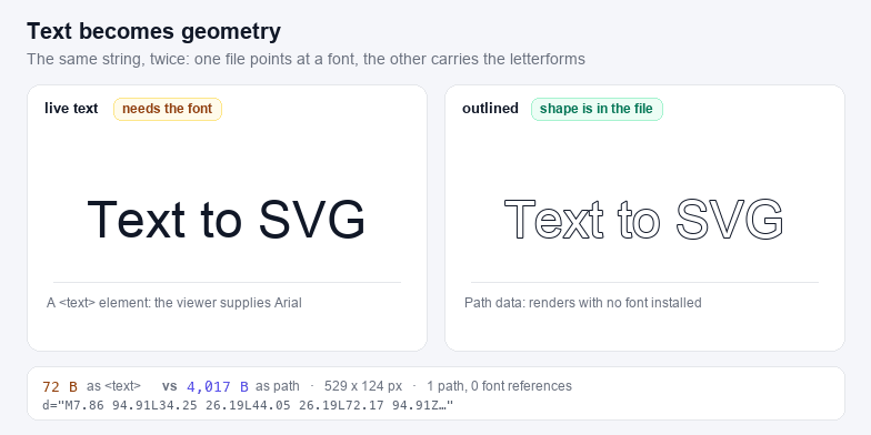
<text> that needs the font, or about 4 KB of <path> that does not. · swipe to see it allWhy outlining fixes the font problem
A <text> element is a request, not a drawing. If the font is missing the browser substitutes something else, and if the font is a webfont the request fails in email clients, in PDF exports, inside <img> tags and in offline documents. Outlined text cannot fail that way, which is why four separate industries insist on it:
- Cutting and engraving. Cricut Design Space, Silhouette Studio and laser software treat a text node as uneditable and may refuse to cut it at all — they need the outline. See SVG for Silhouette Cameo for the machine-specific limits.
- Print and signage. A printer that lacks the font re-flows the line and the position drifts; outlines are already at final position.
- Icons and logos. A wordmark should never depend on a licence or an installed face.
- Email and chat. Most clients strip or ignore webfonts, so the fallback face appears instead of your type.
Where the font comes from
There are two routes, and they produce identical output.
| Route | How it works | Browsers | Best for |
|---|---|---|---|
| Installed fonts | The Local Font Access API lists the faces already on the machine, then hands the tab the bytes of the one you pick | Chrome and Edge 103+; permission prompt once per site | Quick jobs with a font you already use daily |
| Font file | You drop a .ttf, .otf or .ttc; the file is read with FileReader and never leaves the tab | Every current browser | Client fonts, licensed faces, Safari and Firefox |
Either way the font file is parsed here. A collection such as Songti.ttc or Helvetica.ttc holds several faces in one file; the face picker switches between them without re-reading the file.
Tracking, kerning and the space between letters
Three different numbers decide where the next glyph starts, and they are easy to confuse:
- Advance width is the font's own default gap for that glyph, in font units. It is why
iis narrower thanM. - Kerning is a per-pair correction the designer added, usually negative for pairs like
AV,ToandWa. This tool reads it from the font'skerntable or itsGPOSpair lookups and can be switched off. - Tracking is the even spacing you add, in pixels, after every character. Negative tracking tightens a headline; positive tracking opens up small caps set in a logo.
Because tracking is applied in output pixels, it does not scale with the font size the way a kerning value does — at 24 px and at 240 px the same tracking number gives the same absolute gap. When you scale a design later, re-export rather than scaling the SVG, or rebuild the file at the new size with tracking adjusted proportionally.
Multi-line text, alignment and the bounding box
Each line becomes its own path and sits on its own baseline, spaced by line height × size. The box is then measured from the ink: the rendered paths are asked for their real bounding box, and the viewBox is fitted to it plus a margin of 8% of the font size. That is why the export has no em-square air above the capitals and no descender band below a word that has no descenders — and why a swash, an accent or a negative side bearing cannot be clipped at the edge.
Alignment only has something to move when the box is wider than the line. With Box width at 0 the frame hugs the widest line, so a single line looks identical in all three positions and only the short lines of a paragraph shift. Type a pixel width into Box width and the frame is pinned: Left, Centre and Right then move every line inside it, which is what you want for a label, a badge or a title that has to sit at a fixed position. The margin stays 8% of the size on all four sides either way, so the ink never touches the edge.
Chinese, Japanese and Korean
CJK text works exactly like Latin text: the font maps a code point to a glyph and the glyph is outlined. Two practical notes. CJK faces are large — a full Songti or Hiragino collection runs from 20,000 to 60,000 glyphs, so the first parse takes a moment while the table directory is read, and the browser needs the memory for it. And CJK outlines are dense: four han characters at 96 px come to roughly 4.6 KB of path data, where the same four characters as a text node are under 90 bytes. Both are still small files; just do not expect the outlined version to be the lighter one.
What this tool does not do is shape complex scripts. Arabic, Devanagari and other scripts that need contextual joining and reordering will come out in isolated letterforms, because that requires a shaping engine such as HarfBuzz rather than a glyph lookup. For Latin, Greek, Cyrillic, CJK, kana and hangul the mapping is one-to-one and the output is correct.
When a simpler route is better
If the SVG already exists and only has text inside it, you do not need to retype anything: SVG Editor lets you edit the markup, and the SVG Validator tells you why a file that contains text renders blank after an export. If you want the reverse trip — a file full of paths turned into embeddable markup — use SVG to Code. And if you need a PNG of the outlined artwork rather than an SVG, SVG to PNG takes the exported file directly.
For the other half of this pair — pulling a single glyph out of a font, with its metrics, instead of setting a paragraph — see Font to SVG. And if you would rather see the manual routes side by side — Illustrator's Create Outlines, Inkscape's Object to Path, or tracing a rendered bitmap — the text to SVG converter guide compares them with a browser tool and says where each one breaks down.