
Figma SVG Drop Shadow: Why It Gets Cut Off
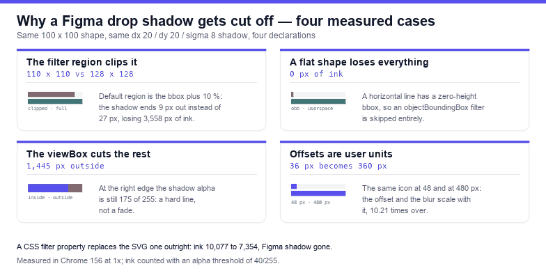
A Figma drop shadow survives the SVG export as a <filter>, and three defaults decide whether you ever see it: the filter region, the viewBox, and the fact that blur and offset are user units. Measured on a 100 × 100 shape carrying a shadow of dx 20, dy 20 and σ 8, the default region inked 11,860 pixels while an explicit 200 % region inked 15,418 — 3,558 pixels of shadow that the file describes and the browser never drew.
All fixtures below are 300 × 300 canvases rasterised in Chrome 156 at 1×, drawn through an <img> and read back with getImageData, counting pixels whose alpha exceeds 40/255. The shape is always the same #5850ec rectangle, so the only variable is the filter declaration.
What Figma actually writes
Figma exports a drop shadow as a filter named after the layer, usually filter0_d, containing a chain: feFlood for the colour, feColorMatrix to take the source alpha, feOffset for dx/dy, feGaussianBlur for σ, a feComposite to clip the flood to the blurred alpha, and two feBlend nodes to put the shape back on top. Recent exports also write the region explicitly (x="-50 %" y="-50 %" width="200 %" height="200 %"); older ones and hand-edited ones leave it at the default, which is where most cut-off shadows come from.
The chain is longer than it needs to be. Measured against a single feDropShadow with the same dx, dy, σ and opacity, the two are pixel-identical: 0 differing pixels, 6,610 px of ink each, the same 80 × 83 box. So every fix below can be expressed as one primitive instead of seven.
Cause 1: the filter region is the bounding box plus ten per cent
With no explicit region, a filter operates on a box 10 % larger than the object's bounding box on every side — 120 % in each axis. For a 100 × 100 square that is 110 × 110, so anything the shadow draws past 160 units is discarded before it reaches the canvas.
| Region on the filter | Ink | Ink box | Shadow reaches |
|---|---|---|---|
| default (bbox + 10 %) | 11,860 px | 110 × 110 | 9 px past the shape |
x="-50 %" y="-50 %" width="200 %" height="200 %" | 15,418 px | 128 × 128 | 27 px past the shape |
The shadow reaches 27 units past the shape edge because dx is 20 and a σ of 8 spreads roughly another 24 before it fades below the threshold; the default region allows 9. That is 3,558 pixels lost, 23 % of the shadow, and it does not look like a bug: it looks like a harder, shorter shadow, which is why designers often "fix" it by increasing the blur, making the visible part softer and the cut worse.
The fix is one attribute set on the filter, and the numbers have to cover geometry, not the bbox percentage: x and y at least −(dx + 3σ), width and height at least bbox + 2 × (dx + 3σ).
Cause 2: the viewBox cuts what the region allowed
Even with a generous region, the filter output lives inside the SVG viewport. Measured on a 55 × 55 shape at (140, 40) with dx 30, dy 30 and σ 10, inside a 200 × 200 viewBox: 4,288 px of ink, an ink box 60 × 83, and at the rightmost column an alpha of 175 of 255 — a hard edge, not a fade. That 175 is the tell: a shadow that ends naturally reaches 0, a shadow that is clipped ends at whatever value it had when the viewport ran out.
Rendering the identical markup on a canvas padded by 40 units gives 5,767 px of ink, of which 4,322 fall inside the original 200 × 200 window. 1,445 px — a quarter of the shadow — live outside the viewBox and are simply not there.
Reserve the space explicitly: expand the viewBox by dx + |dy| + 3σ on each side, or keep the viewBox and add a transparent rectangle that covers the shadow. The second option is worse, because it makes the file's own bounds lie about its content.
Cause 3: a zero-height bounding box disables the whole filter
This is the one that makes elements vanish. Filters default to filterUnits="objectBoundingBox", which expresses the region as fractions of the object's bounding box. A horizontal <line>, or any path that is perfectly flat, has a bounding box with zero height — a fraction of zero is zero, and the filter is skipped entirely.
Measured: a line from x 20 to 180 at y 100, stroked 6 wide, with a shadow of dy 16 and σ 6, inks 0 pixels. Not a faint shadow — the line itself is gone. Setting filterUnits="userSpaceOnUse" with an explicit x="0" y="0" width="200" height="200" brings back 3,480 px of ink in a 162 × 27 box: the stroke plus its shadow.
Any element whose bounding box is degenerate in one axis needs user-space units, and the list is longer than it looks: horizontal rules, dividers, single-stroke underlines, tables drawn with <line>, and the flat edges of a chart axis.
Cause 4: the shadow scales with the icon, not with the design
dx, dy and stdDeviation are in user units, so they scale with the artwork. The same file rendered at 48 px and at 480 px:
| Rendered size | Ink box | Shadow height |
|---|---|---|
| 48 px | 36 × 36 | 36 px |
| 480 px | 360 × 360 | 360 px |
A ratio of 10.21 for a 10× render, which is exactly what user units mean and exactly what you do not want when a 24 px icon has to work at 240 px as a hero illustration. A shadow tuned at the icon size becomes fog at the hero size. Either keep the viewBox fixed and let CSS scale the whole thing uniformly (accepting the fog), or ship two files with σ recomputed — there is no attribute that pins a blur to screen pixels.
Cause 5: a CSS filter silently replaces the SVG one
If any stylesheet sets the CSS filter property on the same element, the presentation attribute is ignored — the property wins outright, and your carefully exported filter never runs. Measured with a shadow of dx 24:
filter="url(#f)"alone: 10,077 px of ink, box 106 wide.- same element plus
style="filter:drop-shadow(0 4px 4px rgba(0,0,0,0.6))": 7,354 px, box 86 wide.
The second number is just the CSS shadow of the shape; the Figma shadow is gone, along with 2,723 pixels of it. This usually happens by accident, because a "card shadow" utility class gets applied to the wrapper and the SVG is inside it — inheriting nothing, but matching a selector like .card svg { filter: … }.
On the plus side, the two syntaxes are closer than the specification suggests. Measured spread beyond the shape edge: CSS drop-shadow(0 0 8px) gives 16 px, stdDeviation="8" also gives 16 px, and doubling the CSS radius to 16 px gives 32 px. So a conversion is roughly one-to-one at this threshold — but treat it as a visual equivalence, not an arithmetic one, and check the corner softness rather than only the extent.
Cause 6: clips, groups and stroke-only shapes
Three smaller traps, all measured on the same fixture:
- A parent clip cuts the shadow. The same filtered rectangle inked 10,342 px on its own and 6,400 px inside a
clip-paththat matches its own outline — box 106 wide shrinking to 80. Clipping applies after filtering, so the shadow is clipped too. - A stroke-only shape casts a hollow shadow. With
fill="none"and an 8-unit stroke, the shadow inks 5,316 px against 6,382 for the filled version, and alpha under the shape's interior reads 0 where the filled version reads 255. If the design shows a soft shadow under a solid block, the block needs a fill. - A scaled group scales the offset. The same filter inside
transform="scale(2)"grows the ink box from 42 to 84 and quadruples the ink (1,599 to 6,393) — the shadow follows the transform, including its direction.
Cause 7: a filter chain that eats the artwork
Hand-written or tool-generated chains fail in a way nothing warns you about: the merge order decides whether the shape or its shadow is on top. A chain built as blur → offset → flood → composite, merged as [shadow, blur] instead of [shadow, SourceGraphic], replaces the artwork with its own blur. Measured on the centre pixel: 0,0,0 instead of 88,79,236, with 10,226 px of ink that contains no brand colour at all.
The check is one line: the last feMergeNode in the chain must be SourceGraphic. If it names an intermediate result, you are looking at a shadow pretending to be a shape.
The definition that survives all of it
One filter, user-space units, explicit bounds, and a single primitive. Replace the exported chain with this and keep the four numbers from the Figma panel:
<filter id="shadow" filterUnits="userSpaceOnUse"
        x="-60" y="-60" width="220" height="220">
  <feDropShadow dx="0" dy="4" stdDeviation="4"
                 flood-color="#000000" flood-opacity="0.25"/>
</filter>
The numbers follow from the shadow: 3σ horizontally and vertically plus the offset, so a σ of 4 and a dy of 4 need at least 16 units of padding on every side, and 60 is a comfortable round number for a 24-unit icon. Applying it to the whole file rather than one element is the safer default, because the region then covers every path in the drawing:
const svg = document.querySelector('svg');
const bb = svg.getBBox();
const pad = 60;
let fixed = 0;
svg.querySelectorAll('filter').forEach((f) => {
  if (!f.querySelector('feDropShadow, feGaussianBlur, feOffset')) return;
  f.setAttribute('filterUnits', 'userSpaceOnUse');
  f.setAttribute('x', (bb.x - pad).toFixed(0));
  f.setAttribute('y', (bb.y - pad).toFixed(0));
  f.setAttribute('width', (bb.width + pad * 2).toFixed(0));
  f.setAttribute('height', (bb.height + pad * 2).toFixed(0));
  fixed++;
});
console.log(fixed, 'filters moved to user space');
Measured on a fixture whose horizontal line disappears under a default filter: after the script runs, the line and its shadow ink 3,480 px instead of 0, and the filter carries the four explicit bounds. Running it twice leaves the file byte-identical, because the attributes are set rather than appended — the same build step can be re-run without stacking padding.
A thirty-second check
- Does the filter carry
x,y,widthandheight, or is it relying on the 10 % default? - Is the shadow's outer edge a fade or a straight line? A value like 175/255 at the last pixel means clipped.
- Is the filtered element flat in one axis? Then it needs
filterUnits="userSpaceOnUse"or it will not render at all. - Does any CSS rule set
filteron the element or its ancestors? The property wins over the attribute. - Is the last
feMergeNodeSourceGraphic? - Does the shadow still look right at the smallest and largest size the file will render at?
The one-line rule: an SVG shadow is drawn by a filter whose canvas is bbox + 10 % unless you say otherwise, and whose blur and offset are in user units — so give the filter explicit user-space bounds that cover offset + 3σ, expand the viewBox to match, and never leave a flat element on the default region.
Frequently asked questions
Why is my Figma drop shadow cut off on two sides?
Because the filter region defaults to the bounding box plus 10 % per side. Measured on a 100 × 100 shape with dx 20, dy 20 and σ 8: 11,860 px of ink with the default region against 15,418 px with an explicit 200 % region — the shadow stops 9 units out instead of 27, losing 23 % of itself. Set x, y, width and height on the filter.
Why did my line disappear when I added a shadow?
Its bounding box is zero tall, and filter regions default to fractions of that box — a fraction of zero is zero, so the filter is skipped. Measured: 0 px of ink on the line, versus 3,480 px once the filter uses filterUnits="userSpaceOnUse".
Why does the shadow get heavier when I resize the SVG?
Because dx, dy and stdDeviation are user units. The same icon measured a 36 px shadow box at 48 px and a 360 px box at 480 px — a factor of 10.21 for a 10× render. Recompute σ for each size, or accept the softness of the scaled version.
Why did my CSS drop-shadow replace the Figma shadow?
The CSS filter property overrides the filter attribute, so a utility class on the element or an ancestor silently discards the exported filter. Measured: ink drops from 10,077 px to 7,354 px, and the Figma shadow is not drawn at all.
Related SVG Workflows
Shadows are one of six things that break between a Figma canvas and a working SVG. These pages cover the rest, in the order they tend to bite.
- Figma SVG clipping mask fix — the intersection arithmetic behind a shape that vanished.
- Figma SVG export not working — blank files, greyed-out buttons and exports that contain one rectangle.
- Figma SVG viewBox fix — why a canvas larger than its artwork crops the effects too.
- Figma SVG duplicate id collision — when two exports share a filter name.
- SVG to PNG — render the file at 2× to see whether the shadow fades or stops.
- SVG editor — edit the filter region and the viewBox in the browser, no upload.
- SVG optimiser — minify a file without collapsing the filter primitives into a no-op.
Related Articles

Try These Free Online Tools
No download required — convert, compress & optimize SVGs right in your browser
SVG Validator
Flag filters with no region, zero-height bboxes and dangling url(#…).
Open validatorSVG to PNG
Render at 2× to see whether the shadow fades out or stops on a hard edge.
Convert to PNGSVG Optimiser
Minify a file without collapsing the filter primitives into a no-op.
Open optimiserSVG Crop / Flip / Rotate
Expand the viewBox by the shadow padding without moving the art.
Adjust the boxSVG to Code
Inline the filtered SVG as a component and keep its ids namespaced.
Convert to code